AUDIBLE UX/UI DESIGN
team
Amy Wisegarver (UX/UI), Sydney Bright (UX/UI)
DELIVERABLES
UX Research, App Design
BACKGROUND
Through my colleague and I’s research and analysis, we decided that we wanted to solve issues that existed in the lack of continuity between the Audible app for IOS, and the Audible app for Android. We found that users were having difficulty locating the wishlist throughout the IOS app. Through this, we also discovered that books cannot be directly purchased from the app. We set out to create a more intuitive path to the wishlist, and an easier purchasing experience through the IOS app.
CONCEPT
After conducting research through interviews, observations, and surveys, we decided that we wanted to test the location of the wishlist to gather data that would place the wishlist in a more intuitive location. We also wanted the ability to purchase books through the IOS app, so we made sure when we tested our users on the location of the wishlist, this element had been added.
GOALS
Business goals:
Increase audiobook exposure
Become a big-player in the audiobook world (audio books / podcasts)
Customer-centric approach
Enhance and redesign the nature of spoken word
Brand goals:
Always support the customer
“Unleash the power of the spoken word”
Positively impact the community
Maintain continuity across devices
USER GOALS:
Easily access audio book
Stay entertained / educated
Promote and support different people / brands that the user believes in
Enhance and redesign the nature of spoken word
SITE MAPPING

SURVEY DATA
Through doing online surveys, we gathered a lot of helpful data to analyze. Based on responses from our survey, the primary age group that uses Audible is from 18-24, and are listening primarily to podcasts. However, in the people that responded to our survey, roughly two out of three people did not listen to audiobooks at all. We also found that people felt Audible subscriptions were overpriced, which could explain why most of the people who responded to the survey had not used Audible. It appeared that those who have used Audible to listen to audiobooks have only used it once or twice.


MARKET RESEARCH
Based on our surveys, online research, and the user groups we wanted to appeal to, our target audience was college students and middle-age professionals who would use the app for recreational, academic, or professional purposes. However, we did want to keep the senior demographic in mind, as there are many users that have been faithful to the platform for many years that would continue their use.
In terms of variety of tools within the app, Audible seemed to take the cake. That could be one of the reasons that Audible may seem like a bit of a steeper price than some other audiobook platforms. However, compared to Libro.fm, it was not only cheaper, but had a much greater range of capabilities. Audible appeared to be the most flexible and advanced option of the audiobook platforms.

SKETCHES
Once we had a chance to discuss our data and the pain points that we wanted to relieve, we began sketching out what we aimed for the app to look like. We didn’t want to change the format of the app too terribly much, as many users already enjoyed their current experience with the app. We wanted the changes to be hardly noticeable, but improve the ease of use with the app, and the ability to buy books from the app and locate the wishlist.


WIREFRAMES

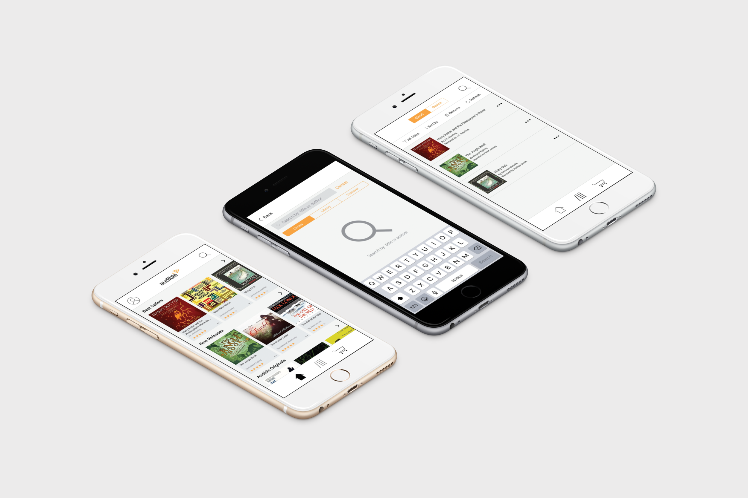
After we had completed some sketches, we dove into creating wireframes of the app. We put the screens in InVision so were were able to task users with locating the wishlist. We discovered some issues with our first iteration of the wireframes based on feedback from our users. It was during this initial testing period that we discovered that we wanted to make the wishlist more accessible.
USER TESTING
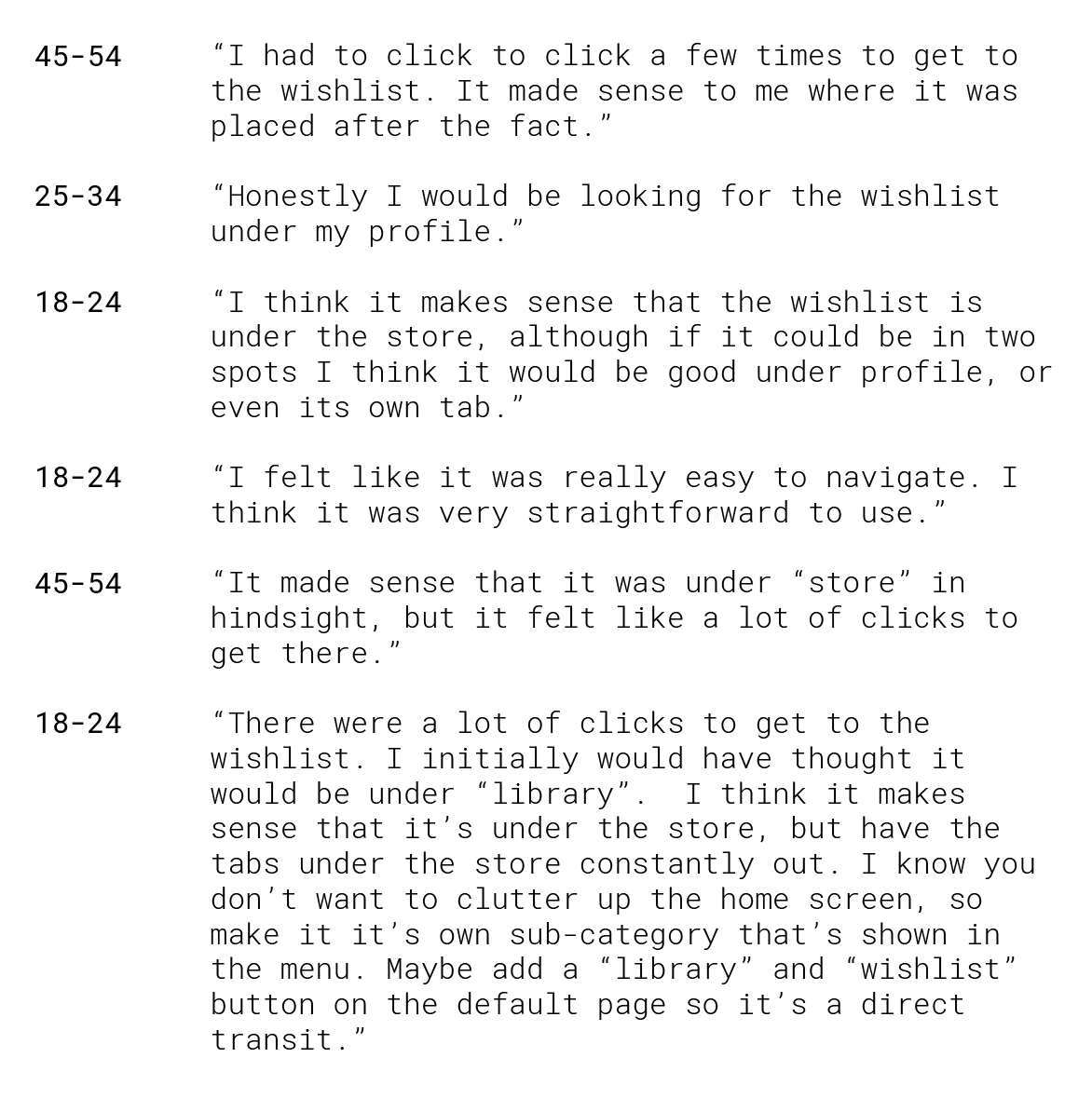
We identified our testing participants by age, and were able to gather feedback from our users that proved to be incredibly valuable in making small tweaks that made great improvements in the overall user experience of the app. It was here we discovered how varied the user’s expectations would be on where the wishlist was located, so we spent the next iteration of changes solving that issue.
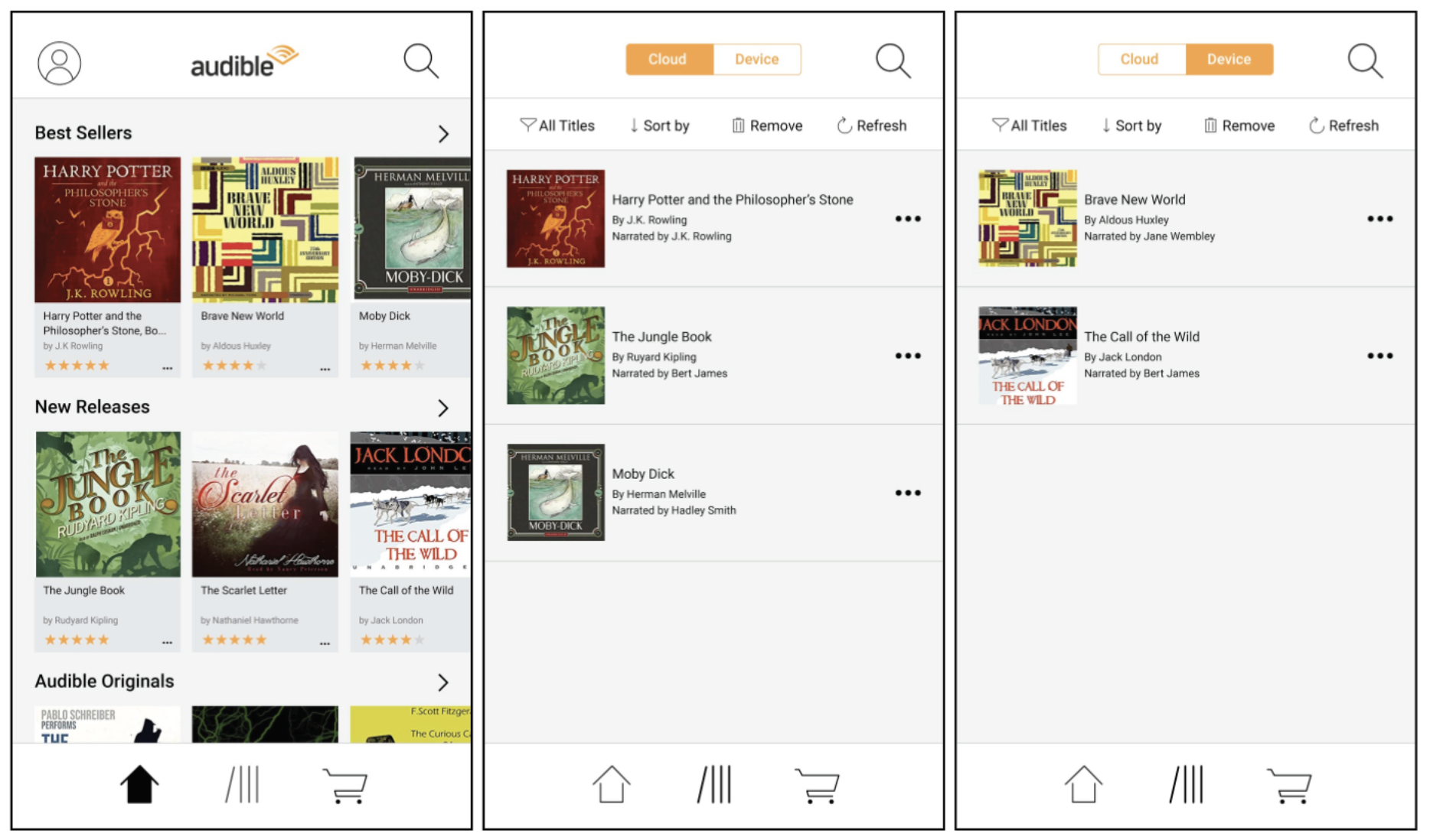
VISUAL DEVELOPMENT
Once we had tested our design in InVision, we went in and made tweaks to our initial concept and further developed the visual elements. We ended up getting rid of the hamburger menu for navigation and put three main navigation icons at the bottom of the screen. The profile icon was placed in the top, left corner of the screen, and the search bar on the opposite side. We put the wishlist on the top of the home page so it was easy to find and access.